Some would disagree with my phrasing unreasonable effectiveness as I have no metrics to back up my data. I can only say that I feel happy when seeing these things, and that other apps don’t make me feel happy.
Introduction
The JingDong dog is known to appear in different poses on the app icon, drawing in people’s attention. Humans have a brain region called the Facial Fusiform Area specifically meant to pay attention to these things. By taking advantage of natural biology, could it be possible to design things more catchy? Humans naturally have a different type of eye motion to track movement.
Andy Kong on eye saccades:
Mullvad VPN does this too. It’s a pretty good VPN, doesn’t automatically renew every month or try to scam you with dark patterns to stay subscribed like NordVPN, who also tried to upsell me after I asked for their 30 day cancellation guarantee. (The above is not promotion, and I do not work for any VPN company. I simply like high quality products and clear communication.)

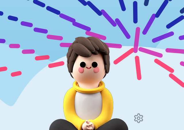
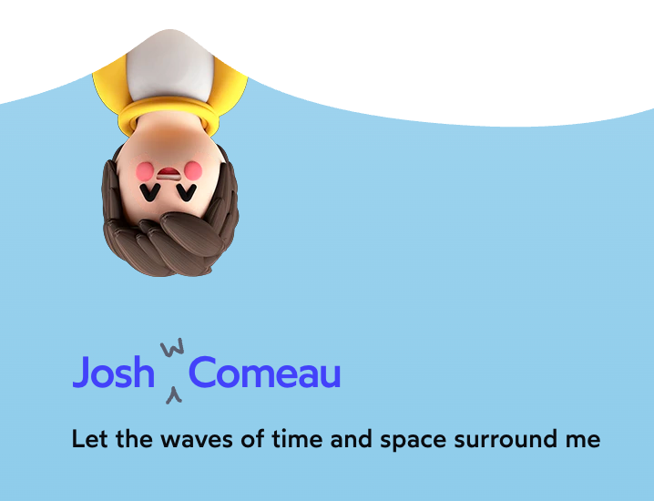
A bit of motion like Josh Comeau’s 3D character popping out draws attention that a CLICK TO DISMISS COOKIE banner doesn’t.
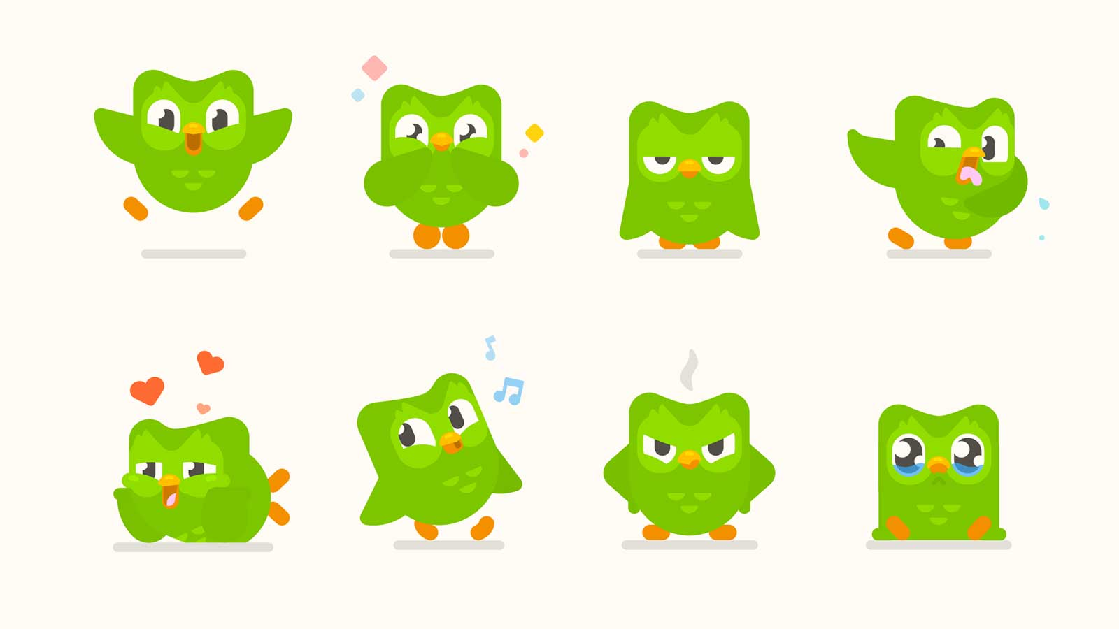
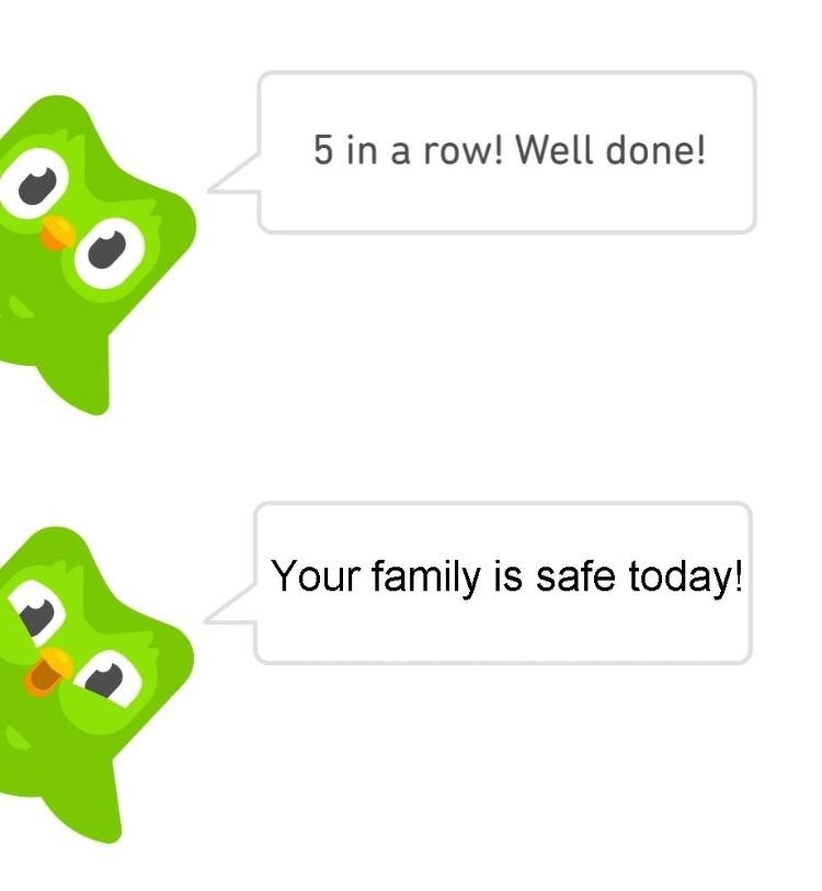
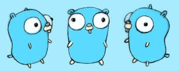
Duolingo’s owl lets you create plushies and memes, like Golang’s gopher. Based on our evolutionary history with cute animals, that’s much more memorable than an abstract Python language snake poster.
On the trends and how they change
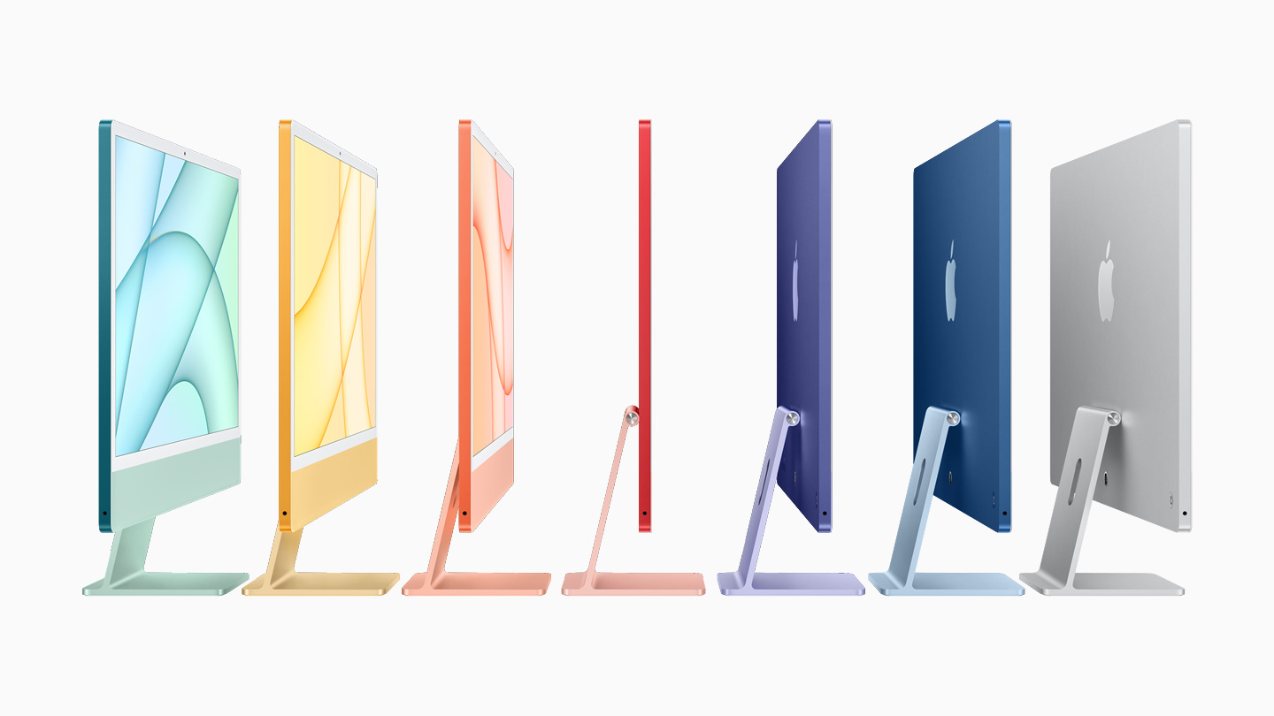
Grayscale, sleek, and minimalist was a defining theme for the past decades. But in how Apple itself moved to more colorful iMac designs, I can’t help but feel these photos are a bit dated and creepy. One part is age: they’re still posing as if the sheer beauty of youth could carry through rather than the senior statemans role Jony Ive should now hold.


Since the trend is likely toward more 3D animation and modeling, Three.js, graphics shaders on the web, all of which have a higher skill ceiling than AI generated tools, we can say that websites who advertise these well (without performance hits) may have higher legitimacy as indicators of product quality.
In typography it may include custom typefaces or an excellent baseline grid.
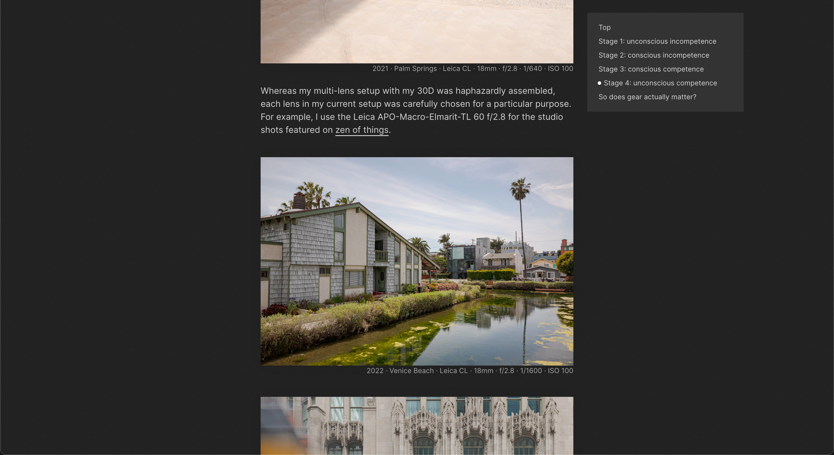
In terms of photography, it may be having a custom photography style (I tried to imtiate Arun’s photos with ChatGPT but failed). On another note, his article about Fujifilm having a similar design quality as Leica convinced me to get a Fuji as my first camera. If somebody who built such a nice website says Fuji is good, then I have trust in his taste in design. Factor two: I was in Shanghai and the Fuji store was nicer than the Nikon store across the street.
It’s a type of word-of-mouth advertising that is priceless. Wondering what other things in the world are like that.
Go on Bloomberg’s news page and it’s just a bunch of random photos. Some substacks will generate AI photos for everything.
Who will be able to get not just a custom photographer, but also known for a specific style like Studio Ghilbi? (Conceivably, some AI engineers may read this and start scouring well-known photographers for a style and make this no longer a high-level differentiator. But it’s possible they can’t fully mimic it, just like we can still tell apart AI-generated photos.)
Furthermore, just good presentation itself doesn’t guarantee legitimacy. Only when it’s a side effect of having such high internal capability is it good. Otherwise it’s called “living beyond your means.”
This article of how photography became widely accessible and no longer is a marker of high quality design is explanatory:
- https://every.to/divinations/dall-e-2-and-the-origin-of-vibe-shifts
- Similarity to social trends too.
So if anthropomorphic characters on apps become widespread because it’s become easier to make them, their indicator as a signal of quality will go down.
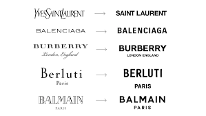
Moreover will be those who try and copy the basics of what they “think” they should be doing rather than actually forging their own design identity. It’s like how cars made their text logos S P A C E D out. It’s like how the message people got from Canvases vs Documents was “draw gray lines around text.”

