Update April 2024
My post got around 10,000 views and was briefly on the front page of Hacker News. Thanks for all the people who took inspiration and commented.
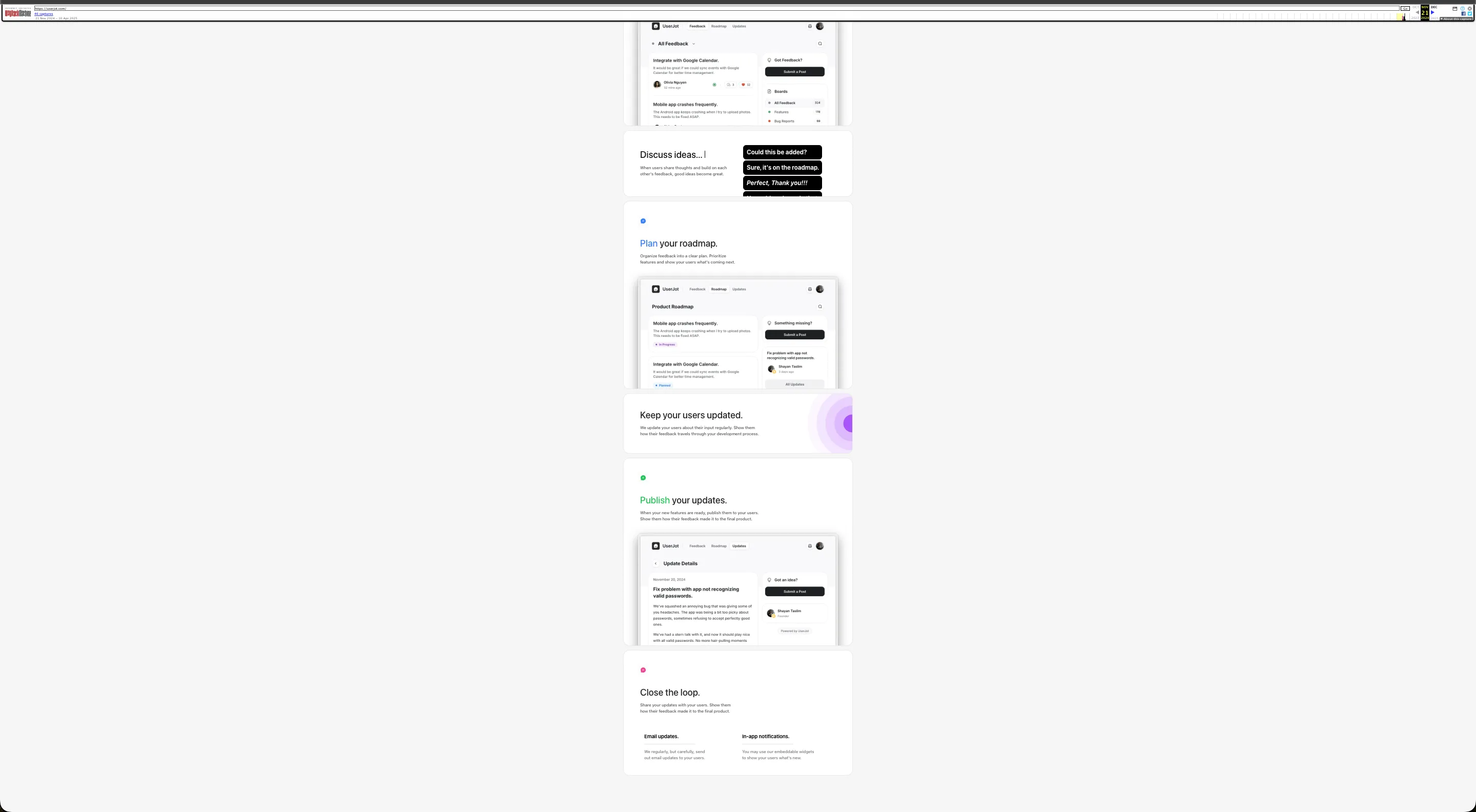
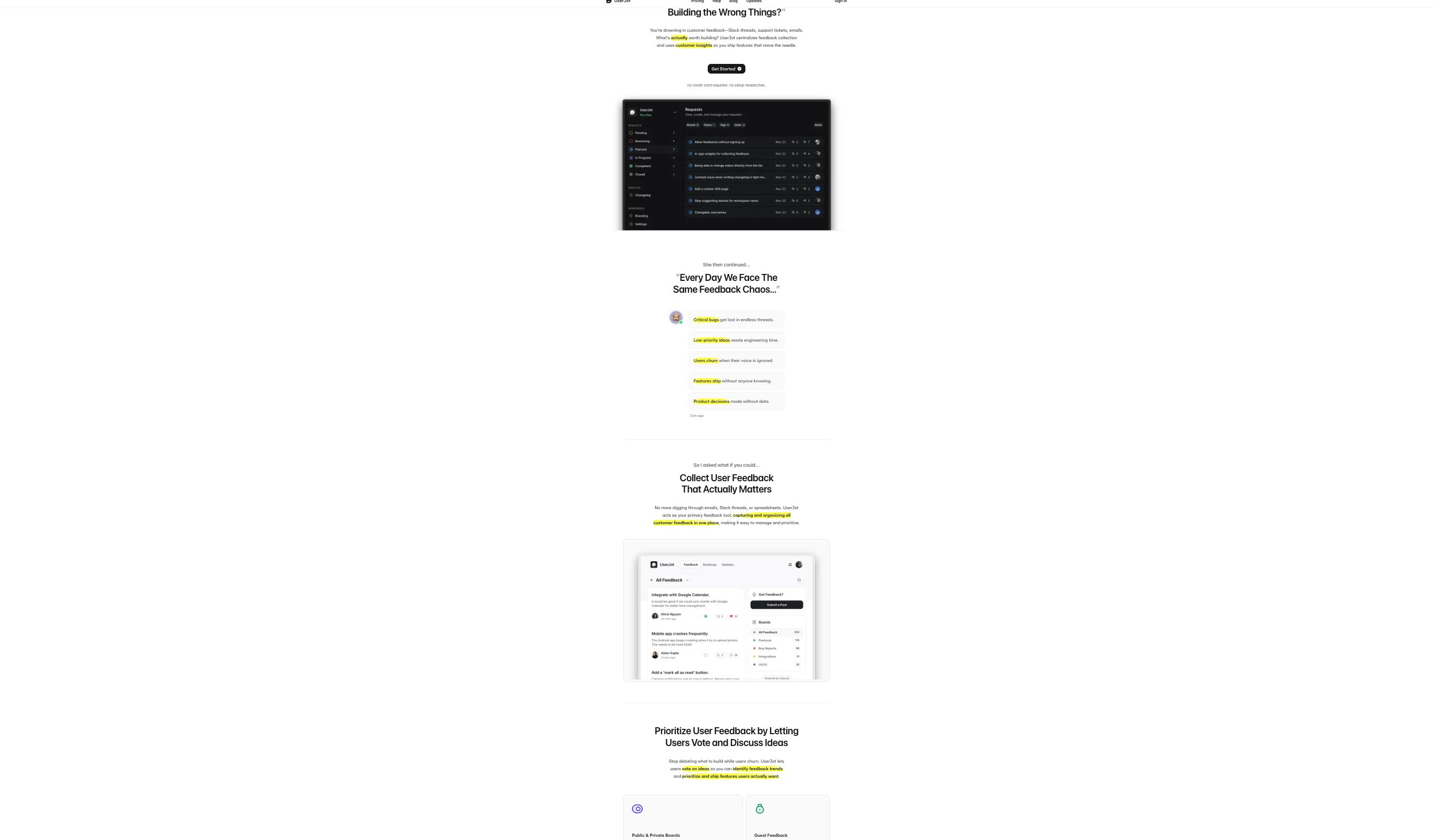
I think the founder of UserJot read my article. At first it was too structured/homogeneous but now I think he’s found a good medium.
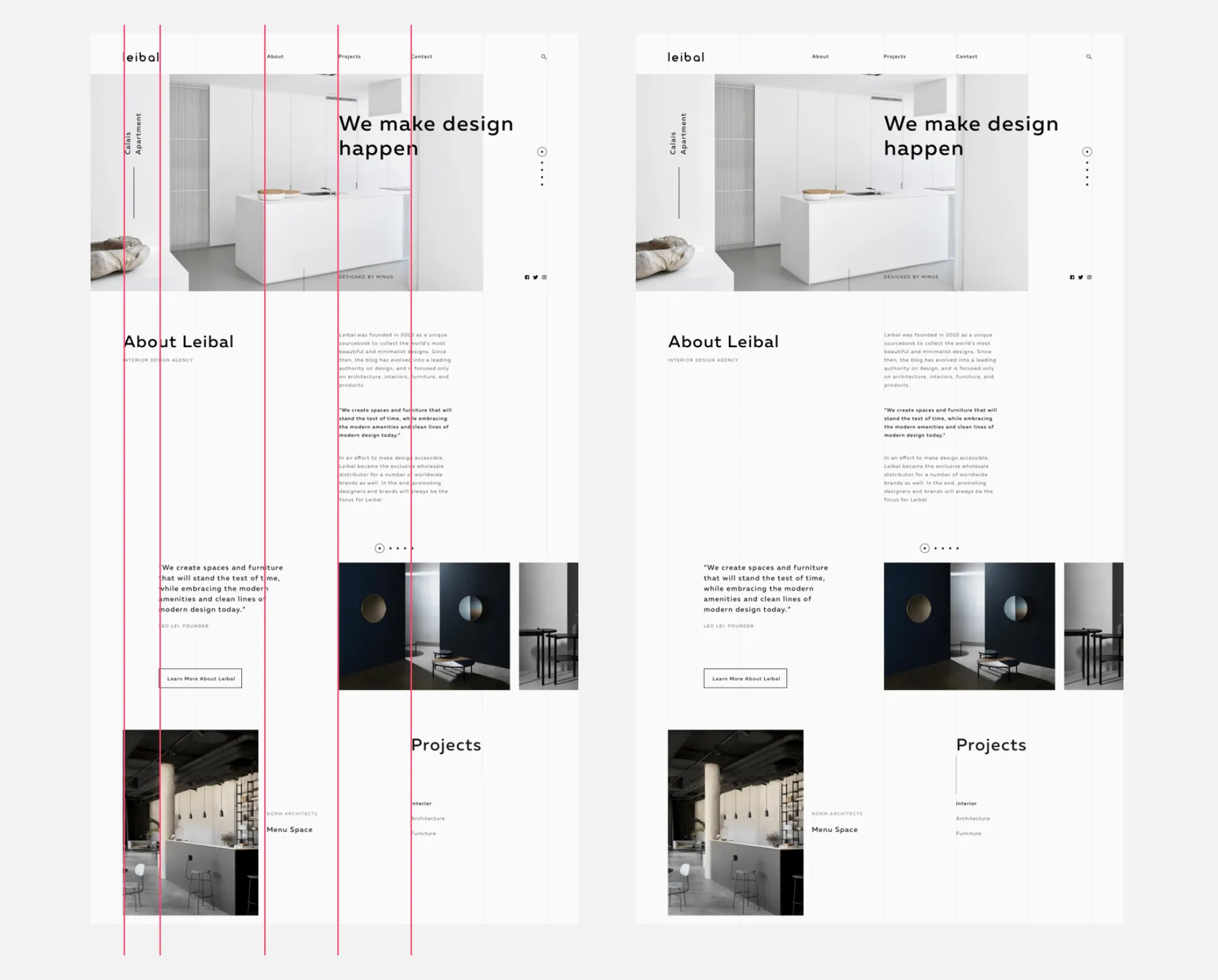
The designers of cal.com also seemed to read it. But like how Kennan puts out the Soviet Long Telegram and out comes a rough approximation of it rather than his intended detailed plan, my article came with certain nuances that seem to reduce into “draw lines and borders around the website container.”
I feel UserJot might’ve seen the article and overstructured it at first, but now they have a good medium where the background color is the same. This reduces information/clutter on the page compared to an explicit border.
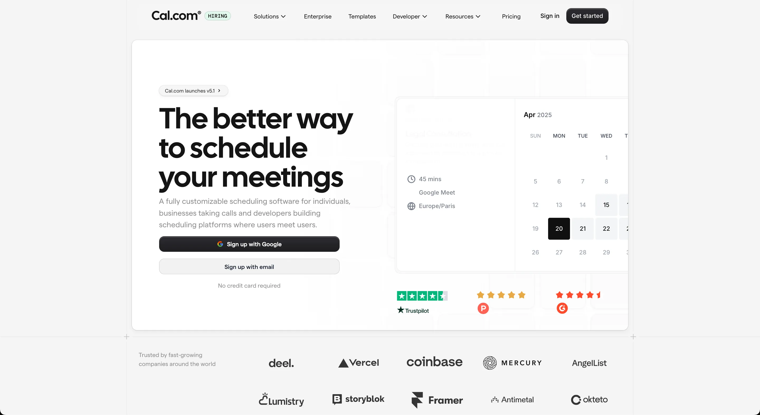
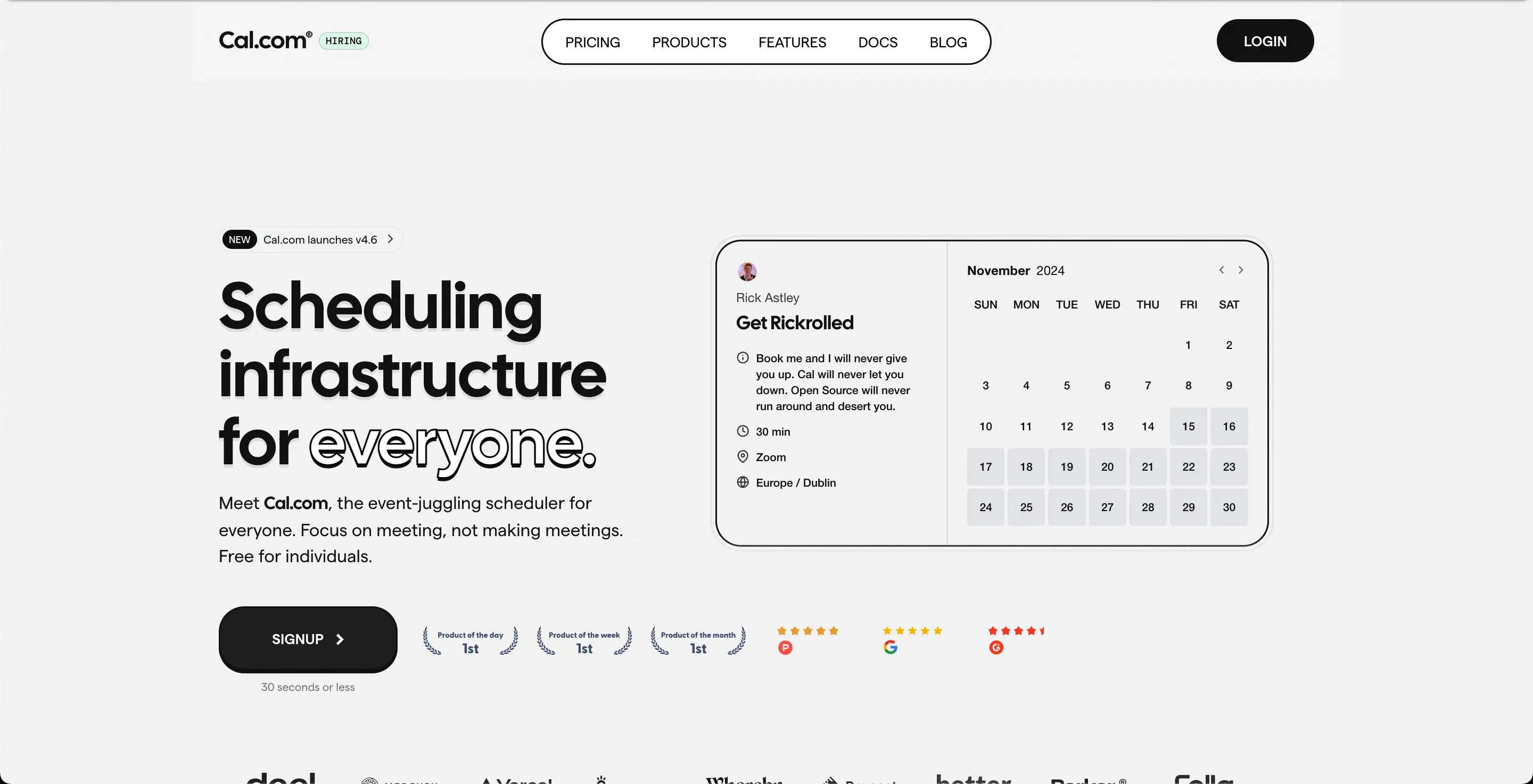
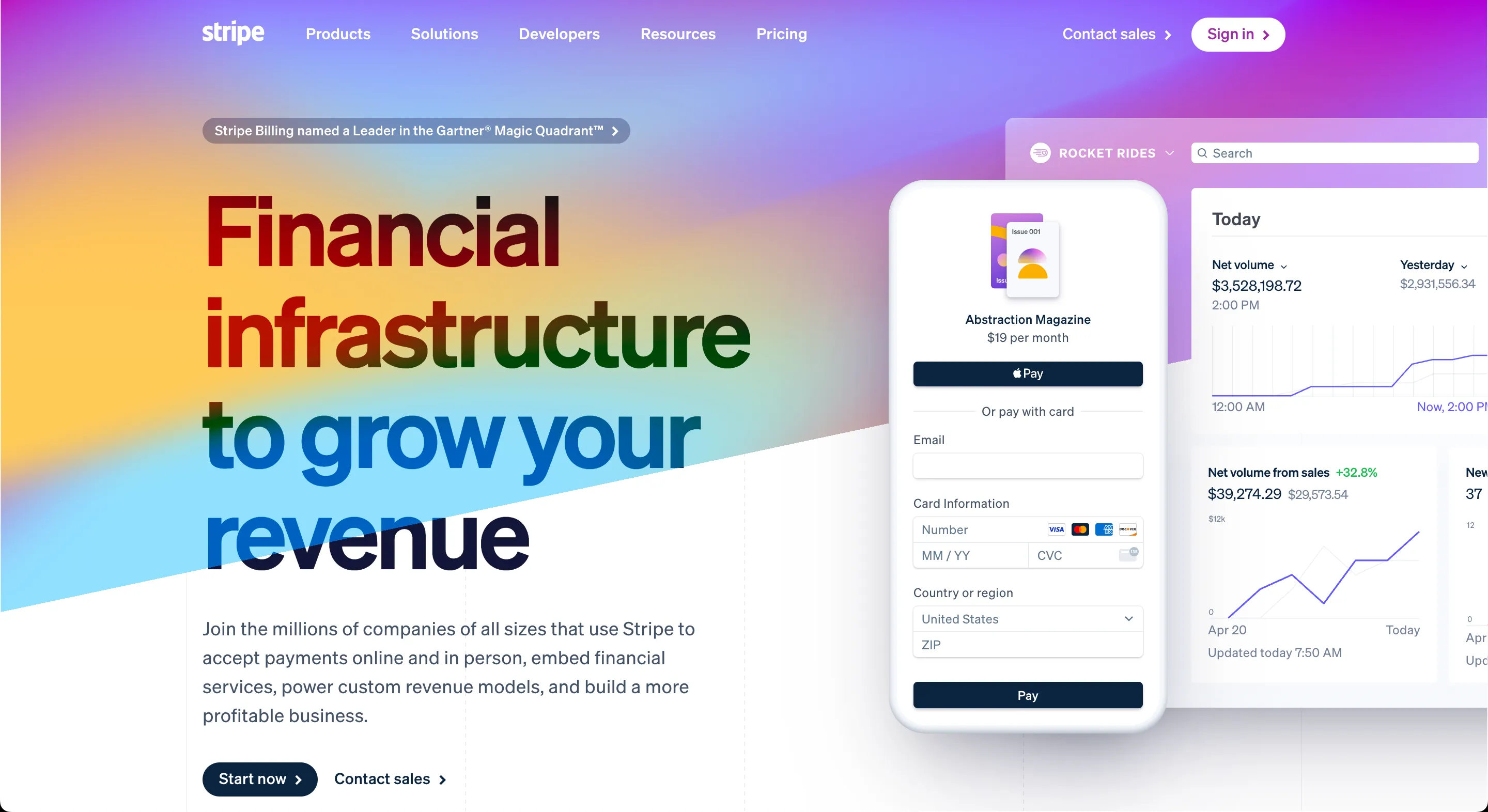
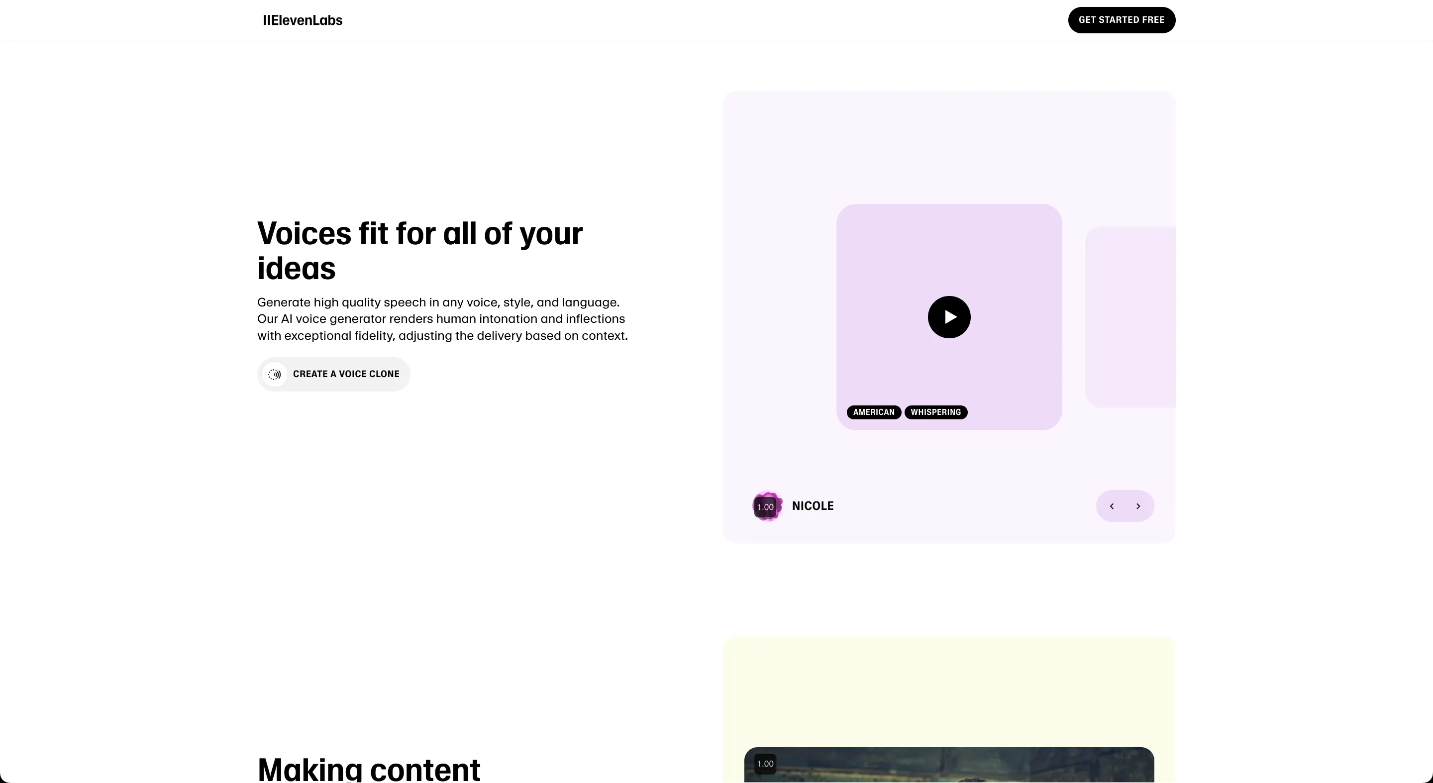
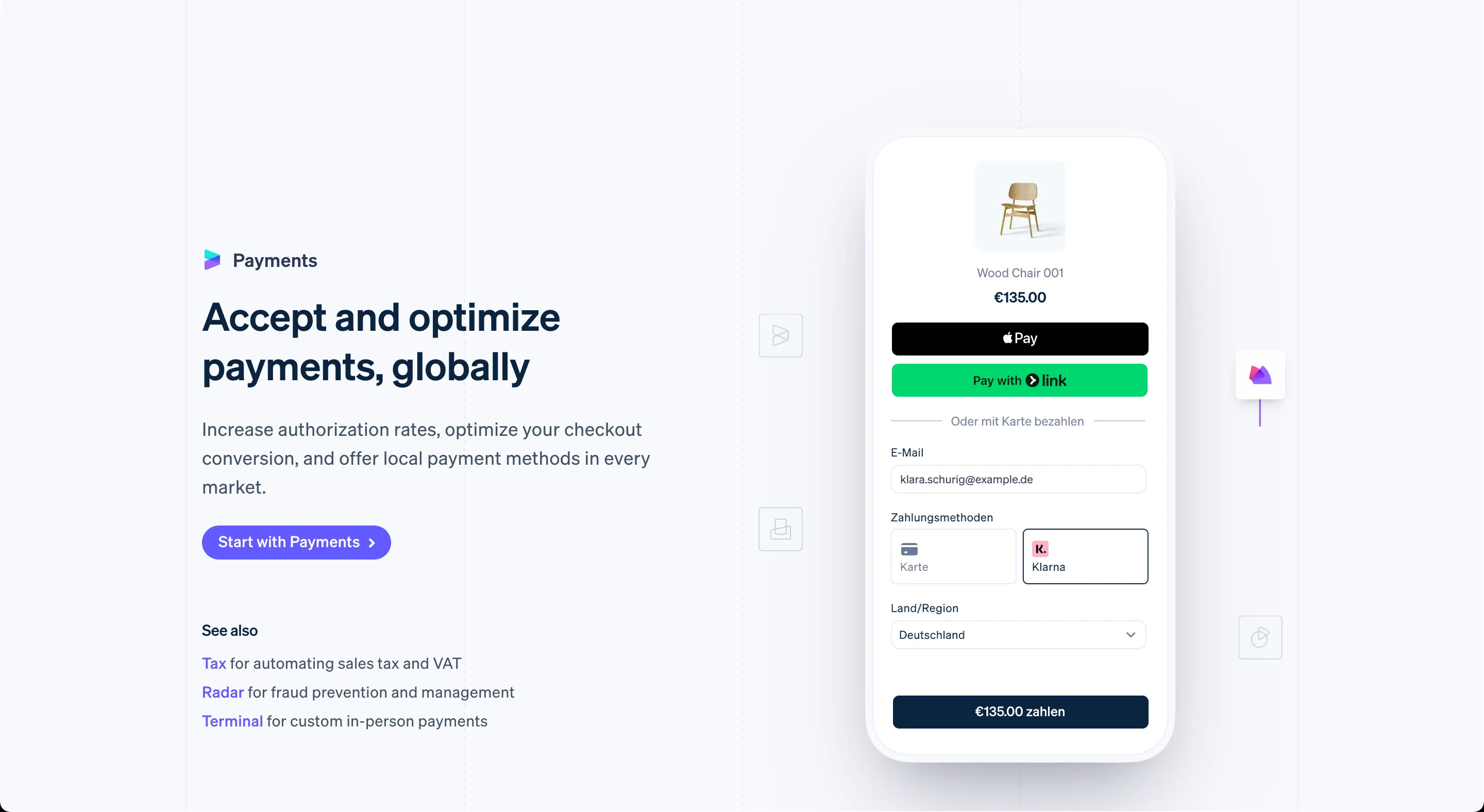
Cal.com seemed to change their design as well, as did Stripe.
Introduction
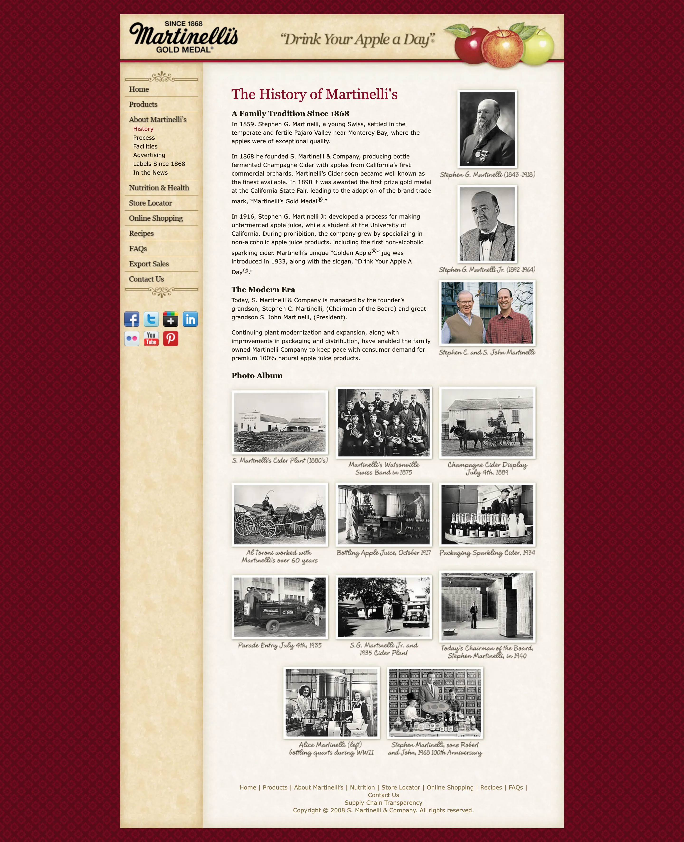
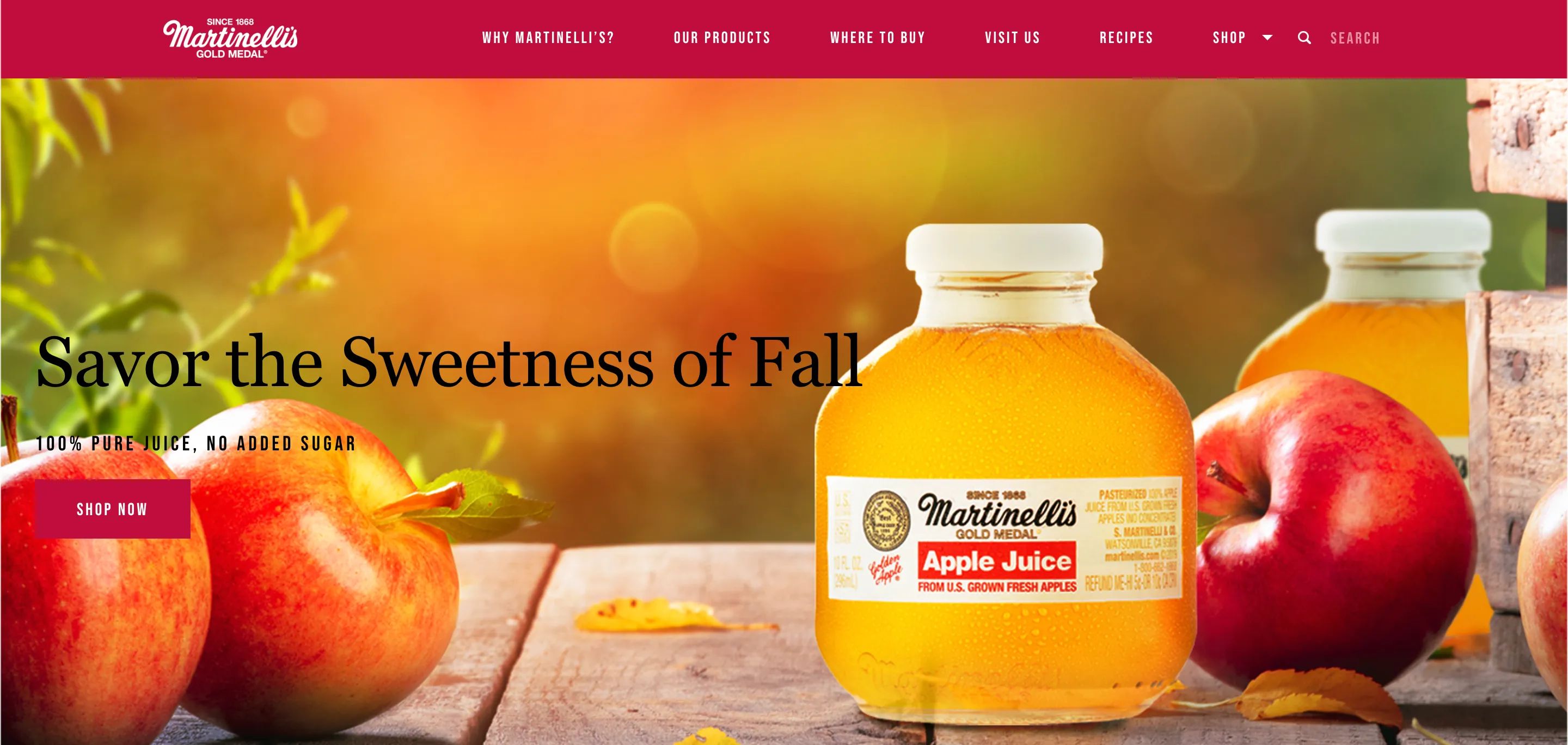
Much web design has reflected that of paper documents: finite with clearly defined edges. The introduction of mobile was troublesome for these sites given the fixed width and non-responsive text sizes, and people switched to a more “modern” and “responsive” design along with other archetypes such as sans-serif in the 2010s, and the current Martinelli site doesn’t feel the same as the old one.
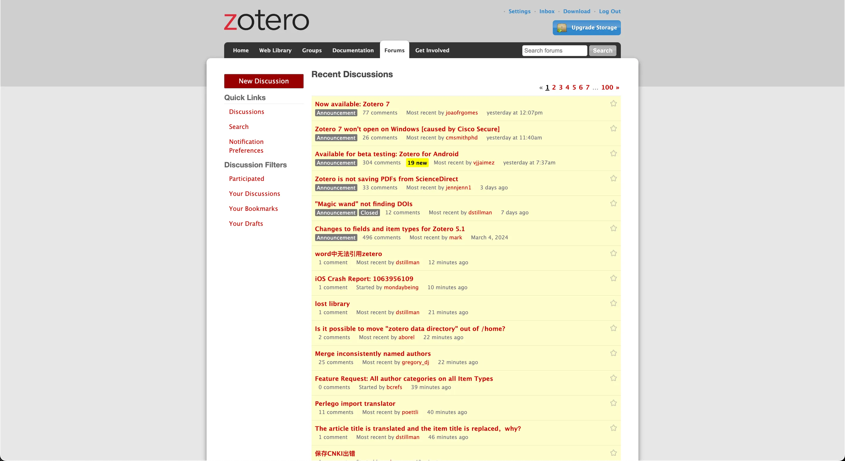
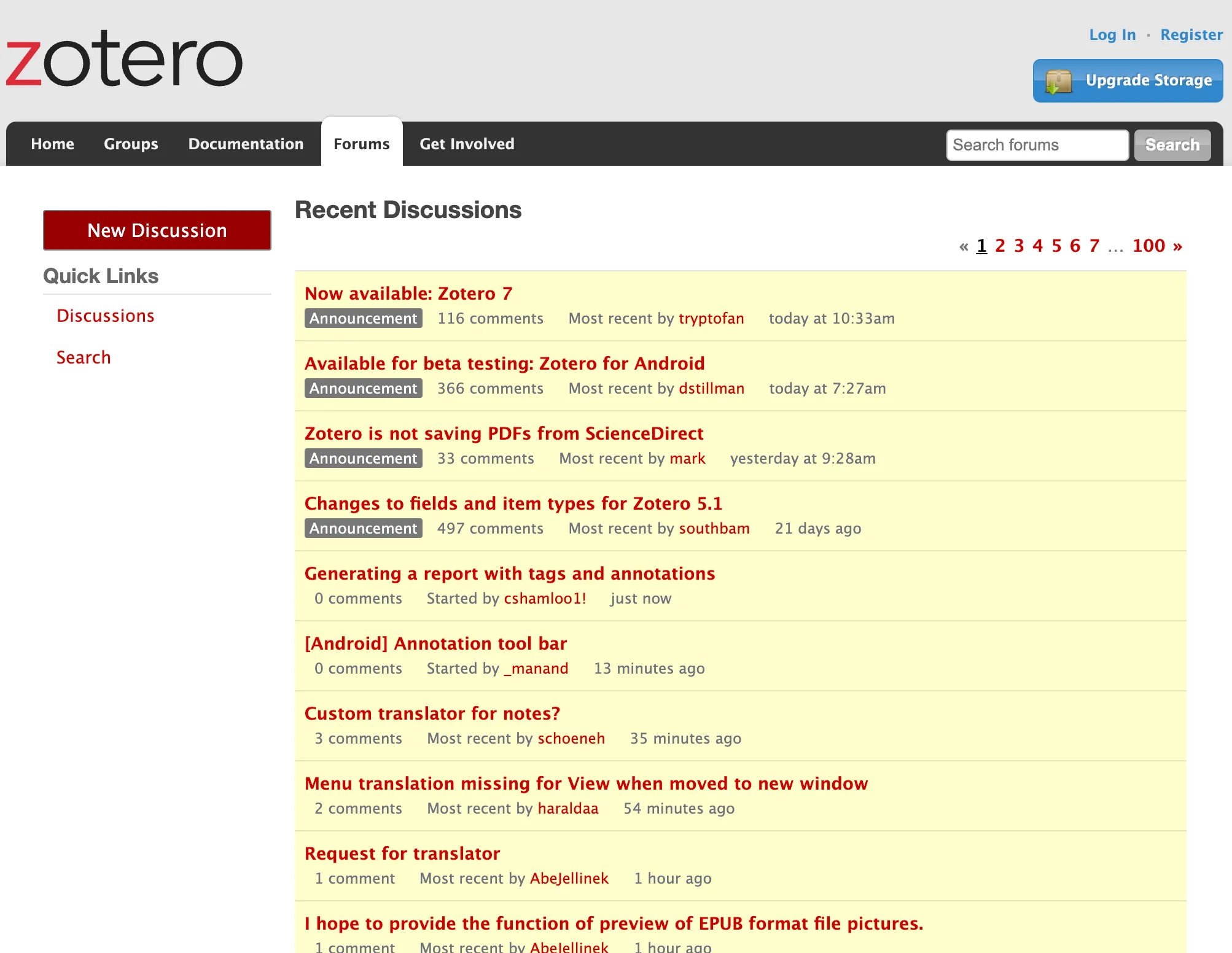
Zotero is another example of document style design, although it manages to be responsive on smaller screens by removing the gray background at a certain breakpoint and leaving the body to be the entirety of the document, rather than drawing it on the screen. The two images below are the same website.
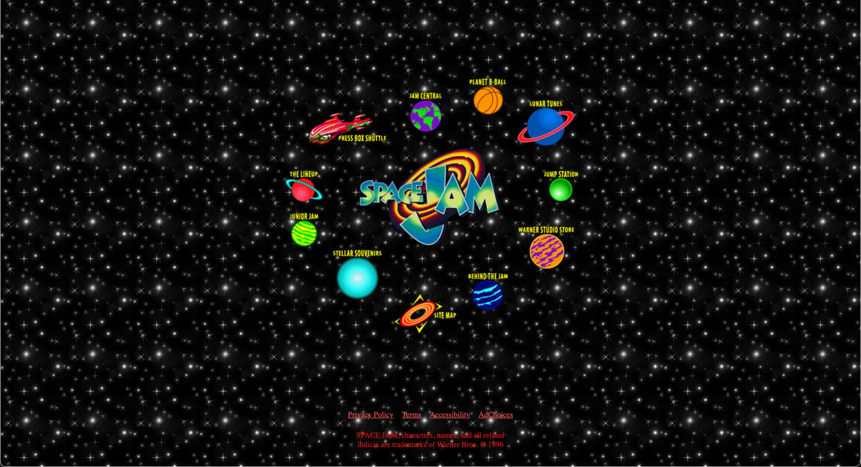
However, by no means is the canvas style recent, as we can see in Space Jam.
A swing back to documents
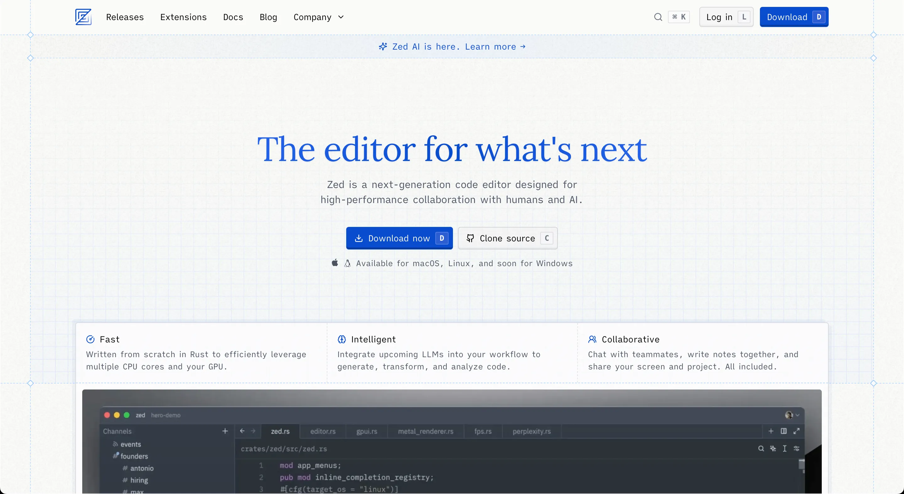
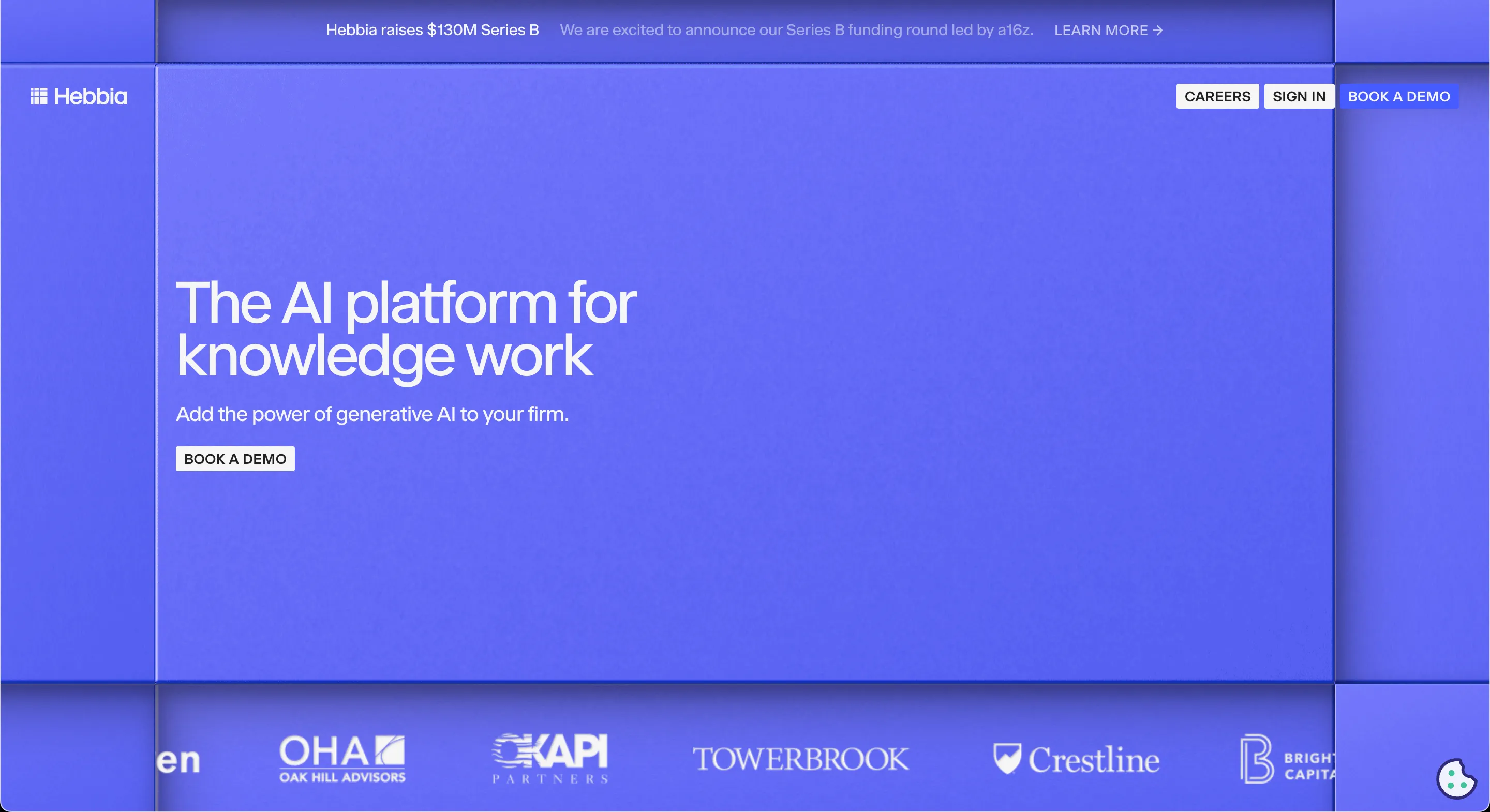
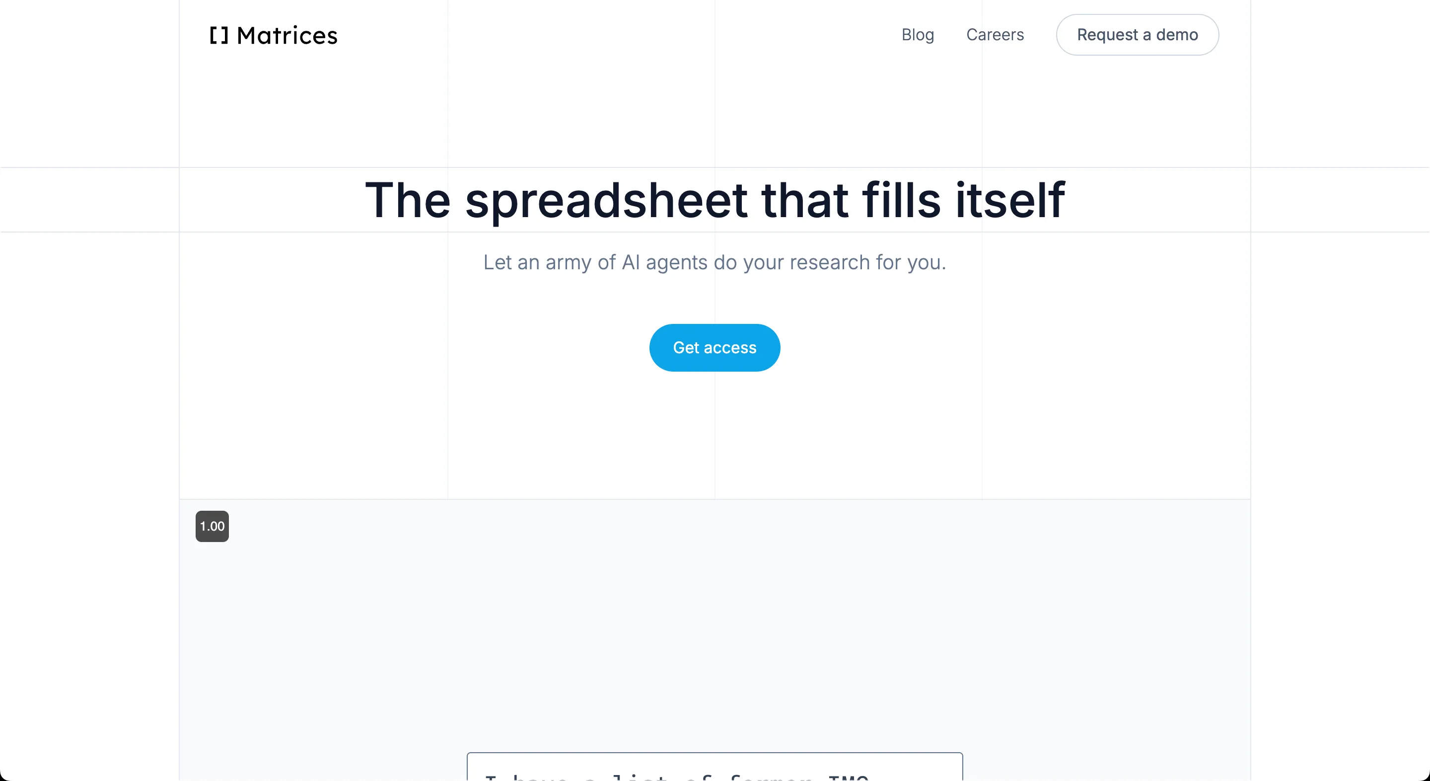
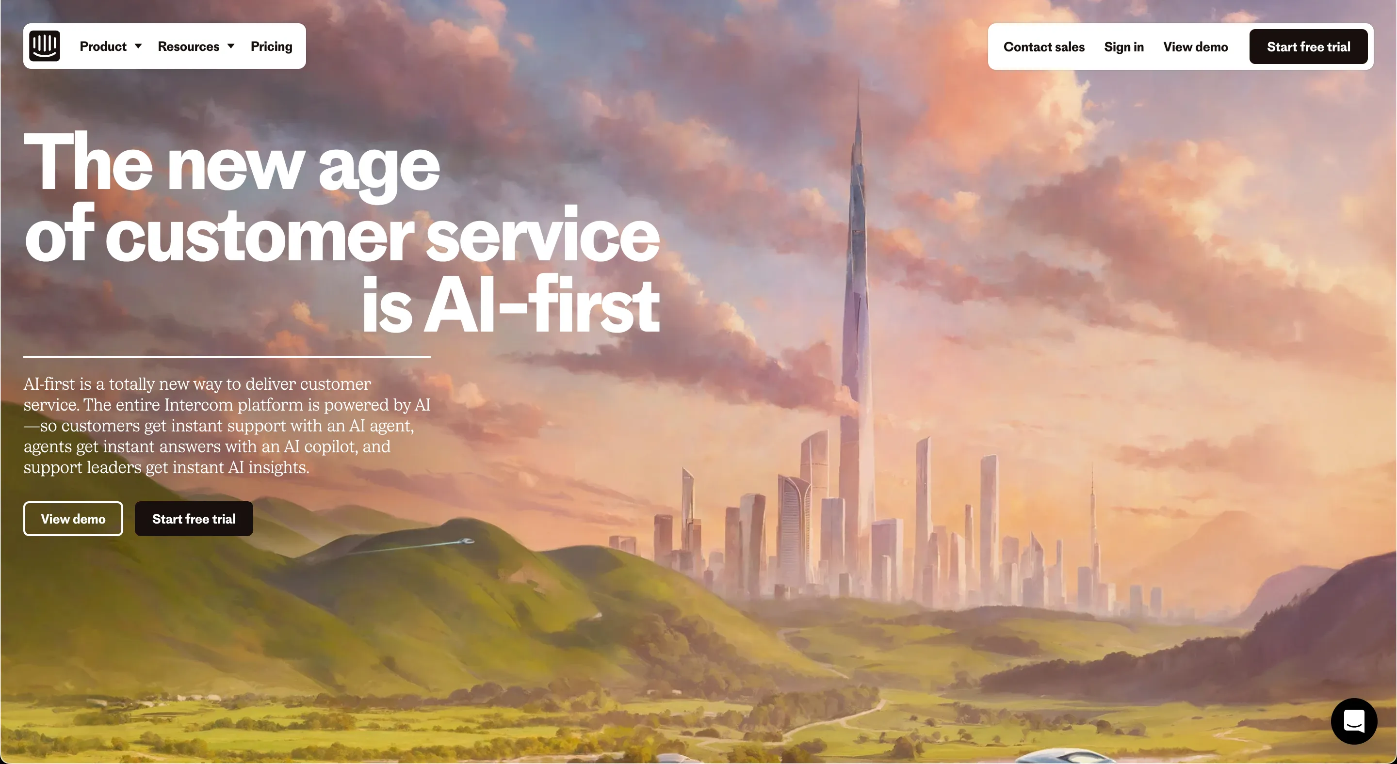
But like many design trends, they swing back and forth, and we are in another phase of movement. I see a shift in style is ongoing: the big text on a clear background is now becoming bordered. See Zed, Hebbia, or Matrices.
You also see it in https://player.style/ or https://ukfoundations.co/. The question is how to handle the sizes between the max-width and the smallest size? Should the text wrap or scale down with clamp? I don’t think multiple breakpoints is the best way to design these multiple-sized documents because that means you’re creating 3-4 different pieces of styled paper.
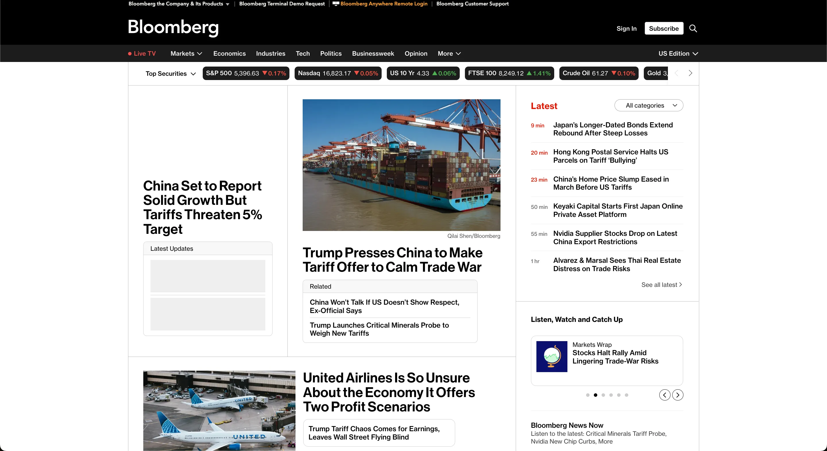
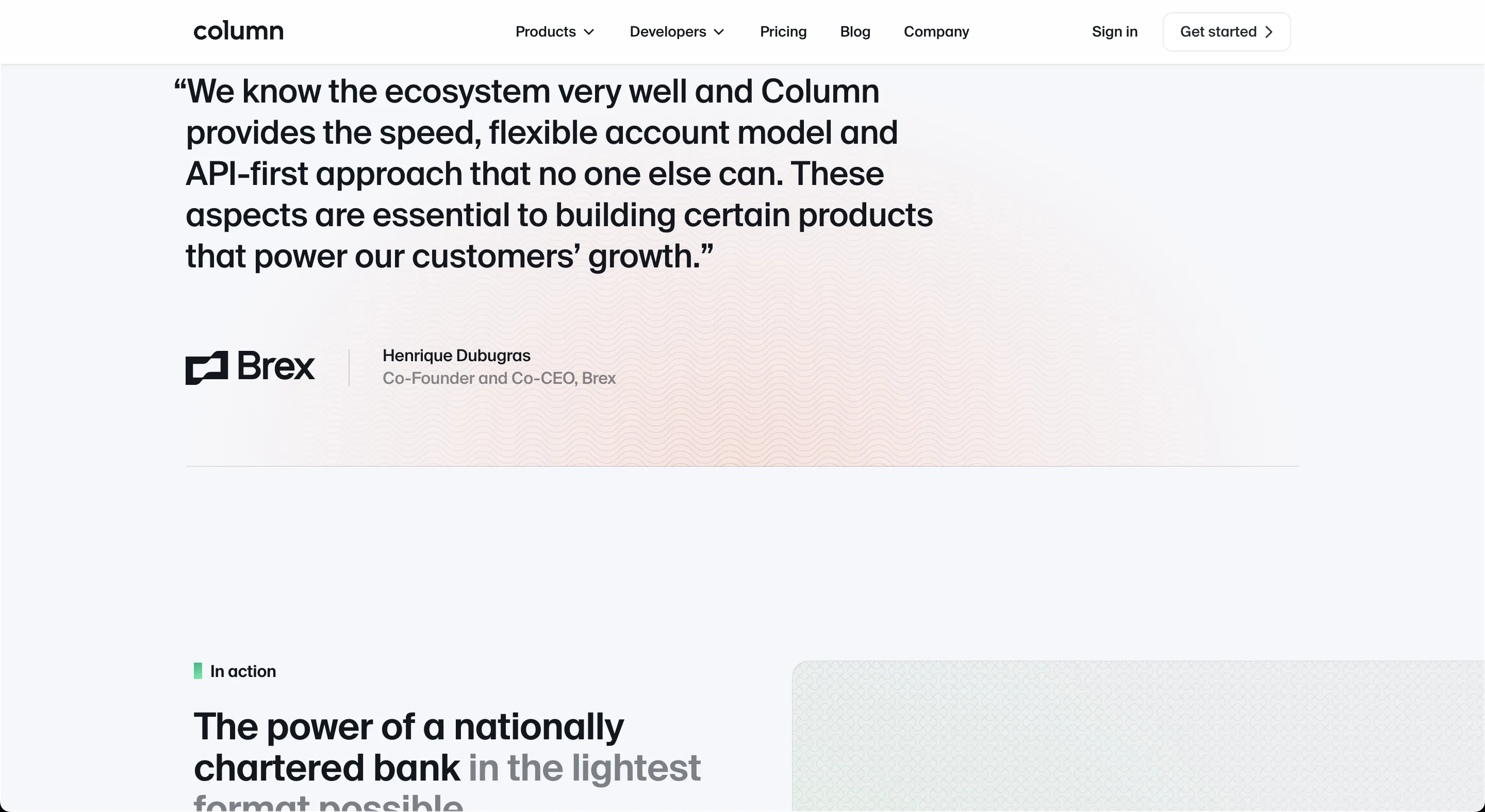
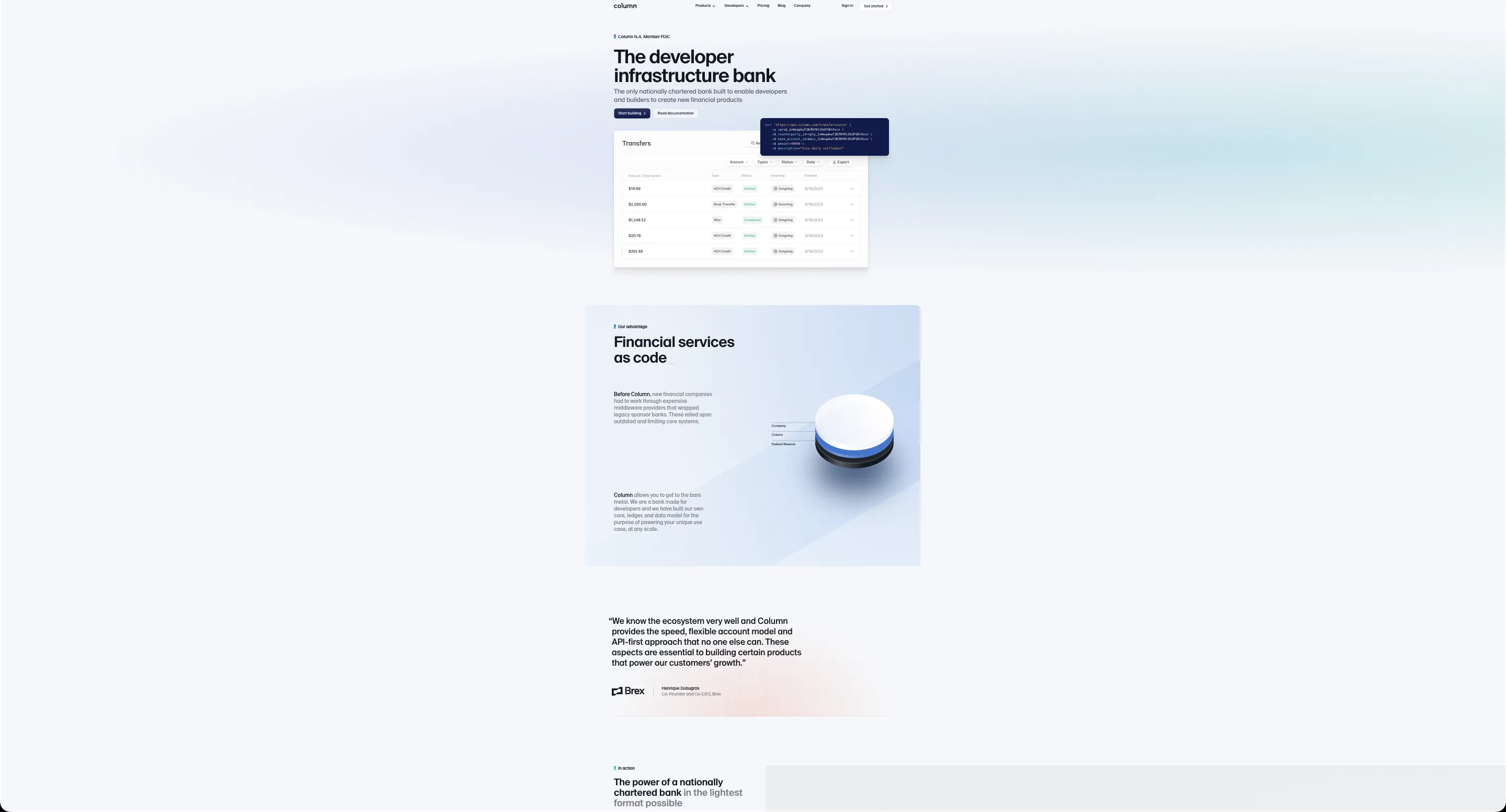
It doesn’t have to just be squareish sections. Bloomberg manages to have a variety of grid shapes in a structured document. It feels polished and coherent.
The non-bordered style is shown below. It has its uses and is a good style, but sometimes it’s not the right fit for the body of main page as we will see.
I think it appeared because designers and front-end were not working together. As a designer the whole page view (for print) is very different from the screen feeling. I got it from this page on web design.
In general I lean toward the cohesive idea of writing out blogs and experiences as a way of teaching and reading from them rather than a prescriptive method. Mostly when I design it’s just based on what feels right. You don’t have to have design systems or Storybook, you could just hack together your own solution in a single Svelte file that is faster. Sometimes it takes as much time to learn about the tool as it does to make one yourself.
Issues
Sections are floating in space
But it’s not the front page that needs a border, it’s the fact that a clearly defined container gives a sense of coherence to the sections underneath the top part, without which seem lost in space.
There’s another resizing issue I’ve seen where the container size is big enough to fit the width of the screen, so there ends up being no padding on the left or right side, making the document weird. I’m generally against using Tailwind’s container class because it has multiple breakpoints, which is saying that there are 4-5 different sized documents that represent your website, and you have to design specifically for each of them.
Text is not meant for immersion
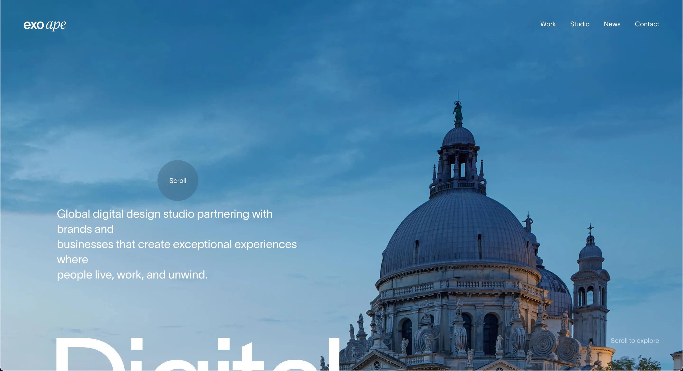
Another issue is that they attempt a “canvas-style” immersive effect but for text. Text is meant for reading. Text is meant to be understood and quickly scanned. Websites are attempting a “canvas-style” design by making the text big and free-floating in space, generally better for conveying feeling.
I’ve always felt that a lot of websites would look much better if they shrank the text size and container width to make it easier for people to scan the page and understand what they’re selling.
See the difference in “text immersion” versus realistic immersion from a photograph?
It’s not mutually exclusive though. You could have a big image at the top that evokes feeling and a blog article underneath.
In my personal website, I try to do both: shooting stars and a landscape in the background combined with gradients for depth with a document in the front so that people can read text.
If I had my paragraphs floating all around, fading in and out, and randomly scattered around the page with no defined container, then it would be much more difficult to read.
There’s too much slop on website homepages
We can extend the shop analogy to the body sections as well: adding a bunch of Twitter testimonials, random pictures of the app with text, other companies’ logos, and Loom videos tell me very little about whether I’d want to use it. Website landing pages now seem much too long. I already have a good idea of the quality of the product after the first impression, so it’s not necessary to create bloated landing pages when something short will do.
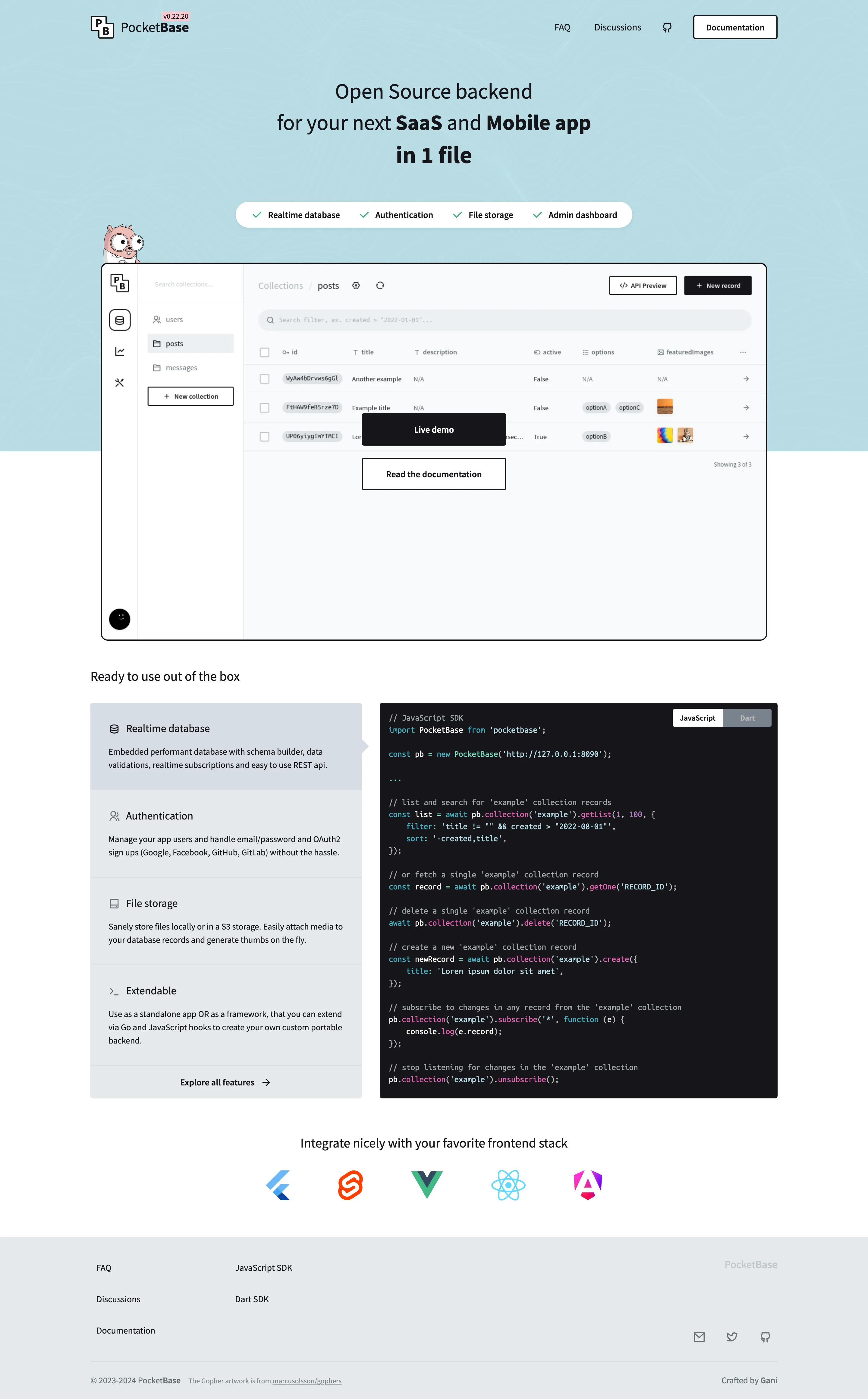
I think Pocketbase is well designed: the logos are specifically relevant to frontend users, it gives you a demo of the app, and there are good examples of code. I also like Klack’s landing page.
Rather than an FAQ section, I wonder if websites will integrate a “LLM question” section instead. I like Pocketbase’s code examples which are relevant to its users. I rarely find that FAQ sections contain the questions I actually want to ask, which tend to involve the usability of the app. The Loom videos are also not great because most people are not very presentable, so that gives a website negative appeal.
Conclusions
Ask yourself the following when designing a website.
- Are you putting in features that are actually convincing to the customer, or are you just following what everyone else does?
- Are you doing immersion/feelings or text/readability?
The skill ceiling for a well-designed website is really high. It even goes into 3D. No need to go that high, but try to reduce scope and increase quality to a minimum standard.
Another thought, May 2025: Some documentation sites include the sidebar stuck to the edge of the screen. This strikes me as strange since if you zoomed out of a piece of paper, would the paper break into multiple parts? However, it seems like docs have standardized upon a specific design so I’m not sure it makes sense to change that.
Comments
No comments yet — be the first.