The follow-up post to Canvases vs Documents.
Background
Some of these classes are tailwind.
- Add
touch-noneto prevent menu icons from zooming in on Mobile. overscroll-y-nonemay not be recommendedoverflow-x-hiddento prevent left/right jittering- Break your words on small screens
textRenderingfor clearer text- Icons don’t actually work?
- LLM Text Input
- Bottom cover pages
- My experiences with marketing
Note: effects differ across browsers, and possibly operating systems.
Overscroll
Overscroll causes bouncing when you hit the top of a page.
The correct answer, I think, is not none. It’s to make the header still while the body overscrolls. If the whole thing is set to none then pull down to refresh no longer works on mobile.
Go to (https://sebvidal.com/) or (https://www.apple.com/).
I believe fixed with margin or padding is used.
Though it’s probably fine to just overscroll the entire page if your header is the same color as the body.
Safari seems to overscroll a fixed header though.
Horizontal Scroll
I had a frequent bug where my trackpad gestures seemed to get “caught” on the page and I could not go back easily.
Preventing this left/right jittering with overflow-x-hidden also seems to address the word overflow issue detailed below.
Small Screens and Devices
I use a Macbook 13 and iPhone 12 mini. I frequently see text that does not break, causing the container width to overflow. Most web apps are likely developed on a 16” MBP, so they look oversized on 13” ones. Good to keep a variety of devices around just to check your designs.
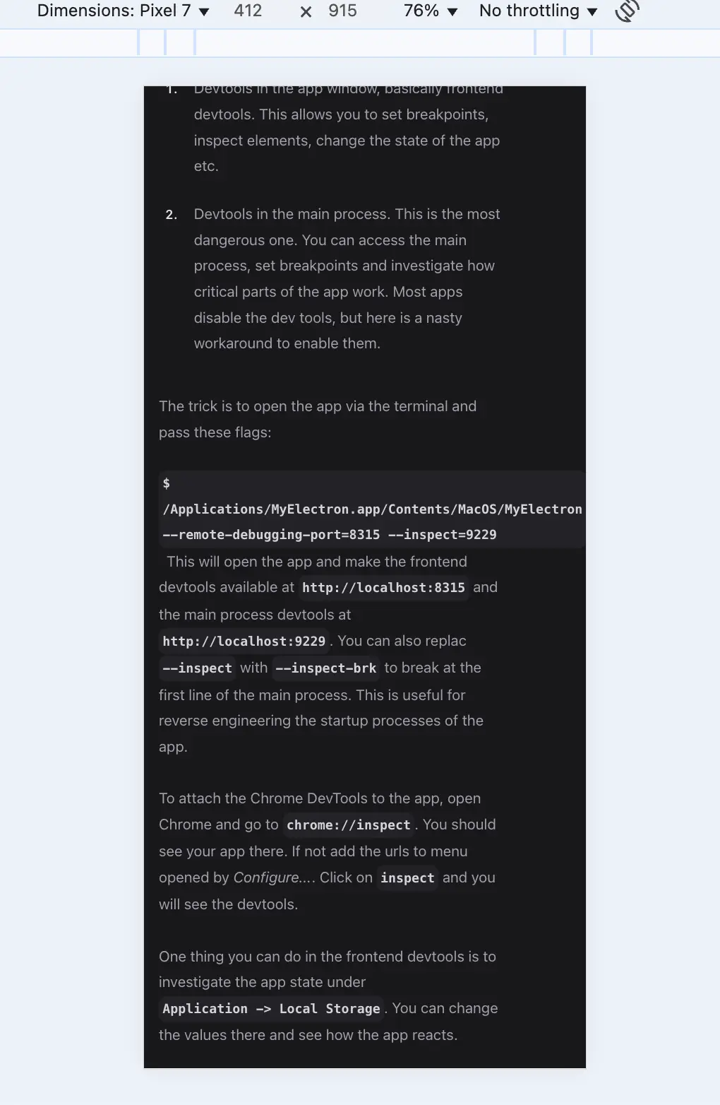
Website source: https://taner-dev.com/articles/crack-electron
textRendering
With geometricPrecision
I feel this property to be rarely used. I prefer geometricPrecision but SvelteKit or Electron may default to optimizeLegibility, which seems fuzzier.
With optimizeLegibility
I feel this property to be rarely used. I prefer geometricPrecision but SvelteKit or Electron may default to optimizeLegibility, which seems fuzzier.
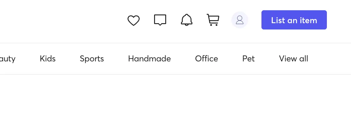
Icons don’t work
Outside of common ones: profile pictures, shopping carts, settings, most icons don’t tell you what they are. The Mercari heart is ambiguous, and though the messaging notifications and cart are obvious, the delay in thinking about what they are feels uncomfortable.
I much prefer Posthog’s icons with words, even if the text is vertical. The purpose of icons is to make text more distinguished (a list of text looks the same) but solely icons lack meaning.
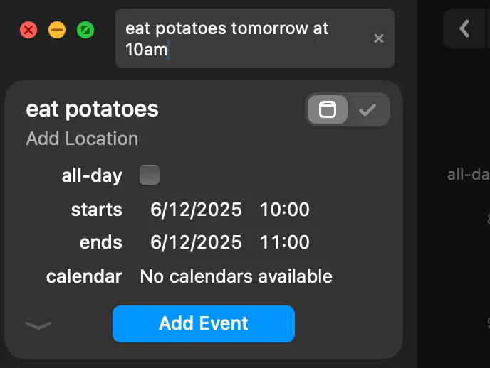
LLM Text Entry to Tasks
An app pattern likely to be common in the future is the “text to tasks” workflow. Rather than solely relying on AI agents navigating a website, efficiency gains come by writing in a textarea add an event for next Tuesday describing etc. and the calendar app will do as such, like Fantastical Calendar does now.
Perhaps you can connect your task list to a thinking LLM and your calendar, and it will timebox/prioritize your day for you.
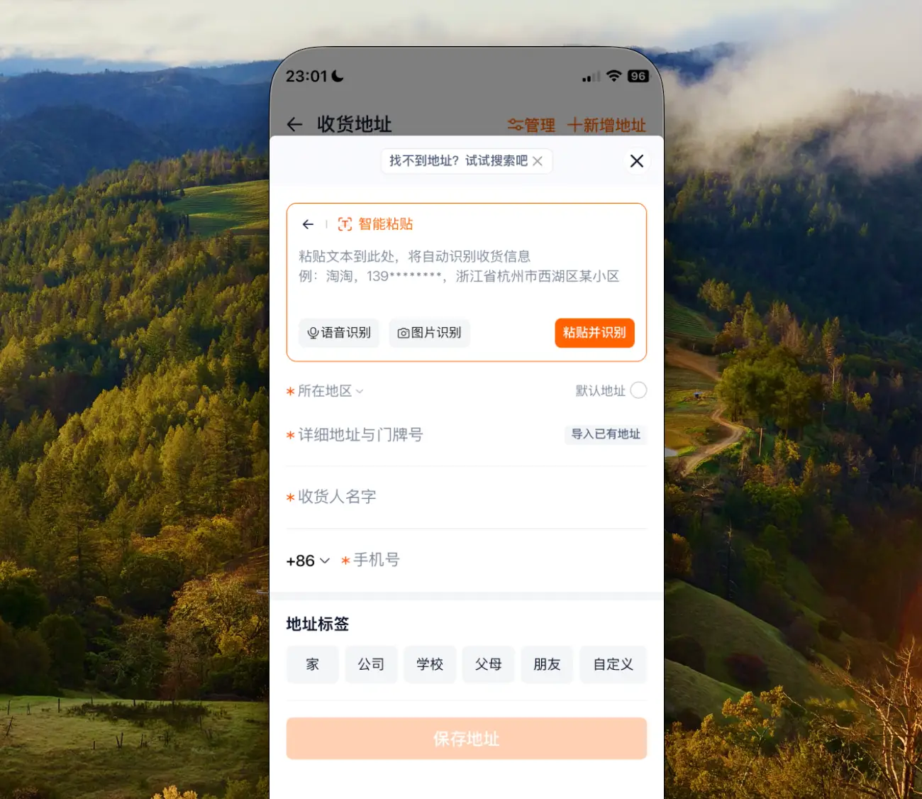
Address fields will also benefit from this. I first saw this in the Taobao app to allow for text to be pasted, such as from a chat, and it matches the fields automatically.

Bottom Cover Pages
After scrolling to the bottom, you can have another call to action. This is a fairly common use case, but I thought I’d mention it.
Note on cover pages and zoom
A lot of websites don’t look that good on a Macbook Pro 13. I assume that most websites have a fixed font size and a margin that closely hits the edge of the Macbook 13. For example, a lot of websites probably look good on a 24” desktop monitor but look absolutely horrible on a laptop. A lot of business/corporate websites are probably like this.
I think to actually fix this, font sizes that use clamping and container margins proportional to the screen size will need to be made. I haven’t fully fleshed out what this may look like yet though. Test on multiple devices!
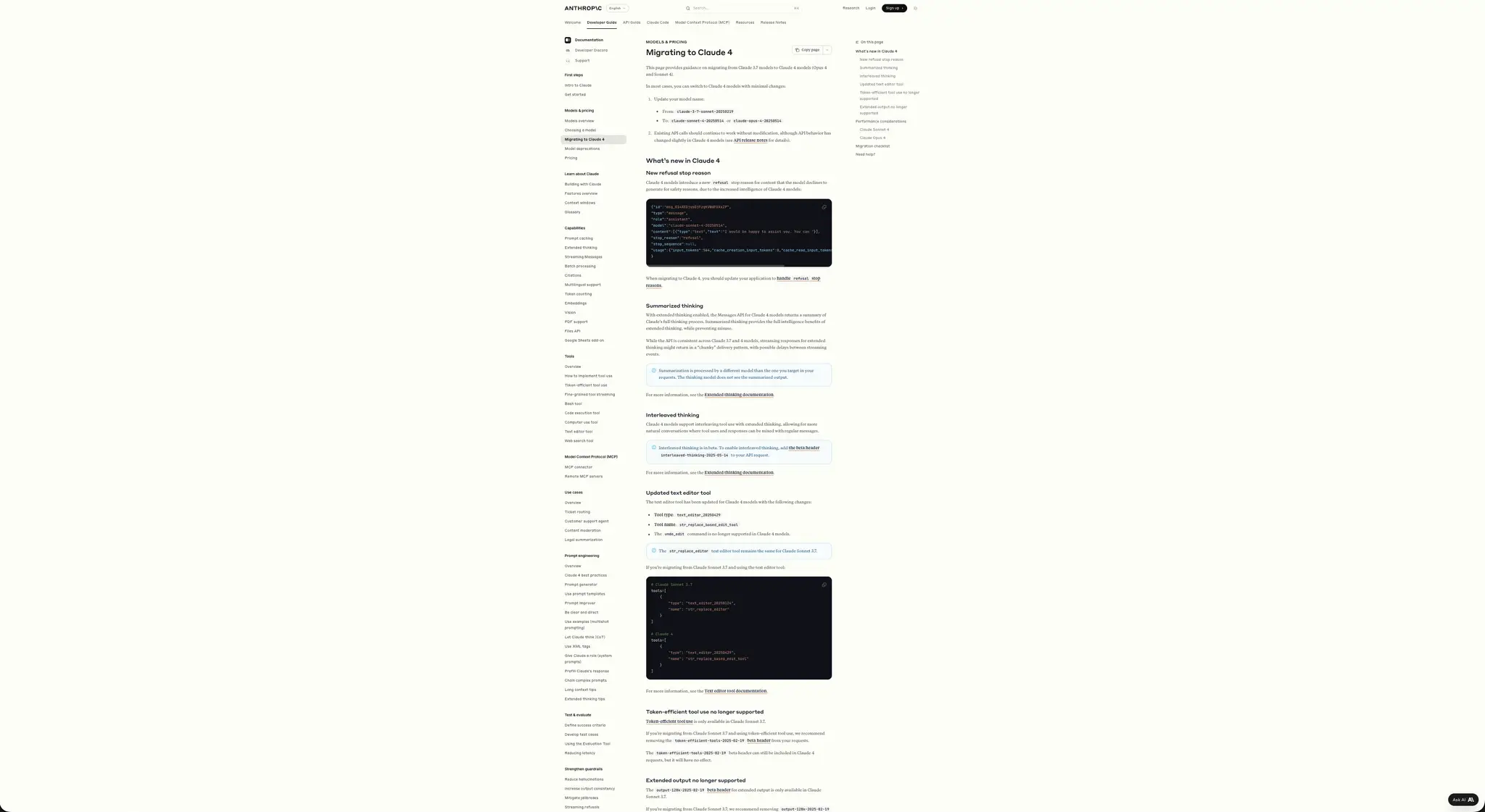
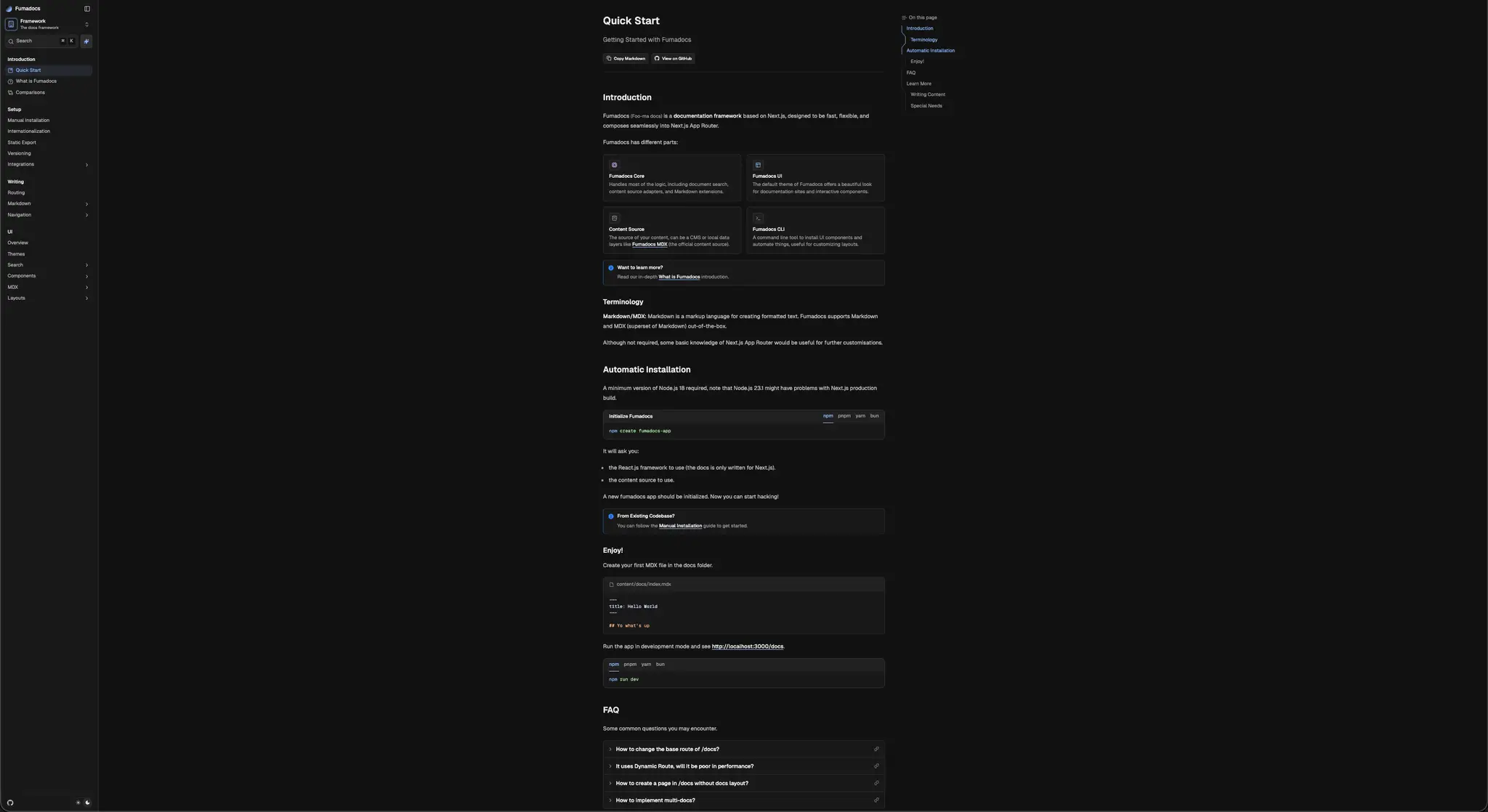
Should sidebars hug the edge?
Polypane or ResponsivelyApp can test multiple screen sizes, but real-world monitors are preferable because reality shows things that simulations don’t.
I see this on docs sites’ sidebars a lot. My suspicion is no: given a sufficiently big enough screen, navigating between sidebar and article buttons back and forth is annoying. This issue is probably amplified on ultrawide monitors.
The solution to clean website design seems to be that of typography: use spacing between items rather than borders, such as Anthropic is doing. (Wappalyzer says they are using Mintlify, but Mintlify has left-stickied sidebars).
Though if people change all the sidebars to be the same location, I feel like the web will be missing its charm. If everything is the same because people think there is an “optimal”, it takes the surprise out of visiting each site. It’s not easy to come up with headlines such as “At 60 miles an hour the loudest noise in the new Rolls-Royce comes from the electric clock” from Ogilvy the advertiser. Or a book title such as “The Free Society and its Enemies” by Popper.
As you are building a site, imagine you have a sheet of paper. This paper can be numerous sizes: how do you get the right font size for basically every screen? How do you structure this paper on the website properly?
How do you make information clear? By taking away what is unnecessary. When you communicate information, don’t add inflection and amplitude variance to your voice: it detracts from the message! (This goes into whether being emotional is useful in conversations or not. I will make a brief long digression.)
Humans update internal state faster than DNA due to ideas. Internal state is the basis for outward behavior. DNA -> Phenotype, Ideas -> Action. Human material constructions are like an anthill, a snail’s shell, or a termite’s mound. Updating internal state faster has spread human material construction: roads, cars, biomass, buildings, at a rate much faster than nature. If something updated internal state and created material constructions faster than humans, we would feel like the animals of Earth today: masses of inorganic materials shifting and swarming around us in ways we feel incapable of controlling or understanding, like many of the humans living in cities today.
Abstract-material thought, the accumulation of ideas, engineering and material construction are what gives man the abilities to fulfill his needs. Abstract-material thinkers are described as less outgoing compared to social-emotional thinkers. This is not true: simply it is necessary to communicate around a third basis: ideas, rather than eliciting emotional reaction from the other individual itself, a habit many do not practice due to lack of mutual context with strangers and the high prevalence of social-emotional thinkers in society.
What type of thinking is necessary to understand the food systems? Advertising and branding emotions are just used to control the masses: go to a store in the USA and everything is vegetable oil, enriched wheat flour in different forms and shapes. I see the nature of r e a lity! I kn o w what to buy! I know basically the majority of SKUs in the š̶͍̩͐͊́͘t̷͈̳͇͛̓͝ơ̵͚̼̭̖͔̆̄̏̈́̃̌̏͋̍͛̐̍r̸̩̀̄́̄̌̐͒͋ë̴̛̦́̾́͆͌̈́̐̈́̋͝!
It is research into polyunsaturated and saturated fats, history, observation of the environment, understanding of federal laws and standards around fortification, deep reading that gives you understanding over the food system! This is key to your persistent long-term health and strength!
Thus those who engage in abstract-material thinking and object transformation (construction, engineering) will have a persistent advantage over other groups. They will build the worlds all others live in. The money system; the laws; all this was built by man. They say God created the world; Man creates the abstract world we all live in.
Back to papers.
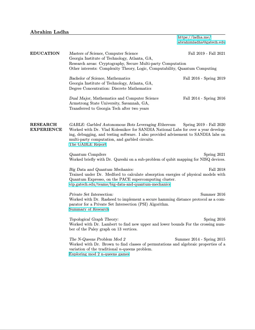
Academic CVs versus the common undergraduate LaTeX template show a big difference in clarity and structure when you stand back.
Misc Thoughts on Marketing
(note, removed link because it seemed like self-promotion)
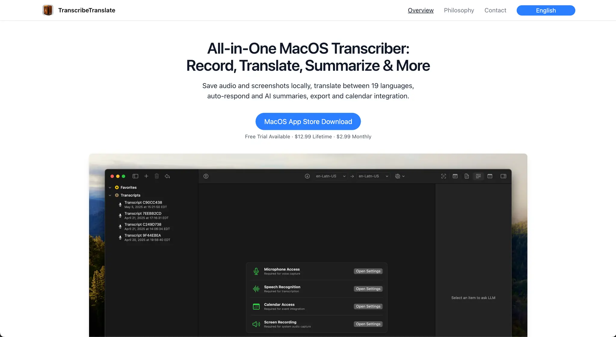
I’ve been working on an app, and despite the app UX being good (and it is easy to download, no logins, native SwiftUI) the landing page didn’t seem to convert well. Out of 400 impressions I got only 10-20 downloads, which is around 5%, which supposedly is normal-ish, but I feel like it could be higher.
The lesson, which is annoying but likely true, is that in the modern world you need to appear good in order to have any shot at things, whether it be grades or Leetcode or research papers. It’s easy to think that in all cases I would evaluate things as they are, but I don’t always manage it: I was in Washington DC and I at first ignored this person who asked for help because I thought he was asking for money, until someone else in my group paid closer attention.
It doesn’t matter if the presentation is faulty or poorly coupled to the underlying job, you still have to do it, as society has created these massive bureaucratic presentation systems as a manner of wealth and income distribution, and most people buy into it if you want mass appeal.
And in general, it’s just hard to make conversation if you don’t have mutual context.
For those in decision-making positions, they should be adjusting the necessary presentations to be more closely coupled to what they are looking for, while constantly on the lookout for new signals that may indicate quality. But because they’re at the top of the organization rather than doing the interviewing at the bottom, they won’t be able to select the actually talented because those doing the interview can’t perceive it, or maybe it is intentional: to select the most rule-following rather than innovative and high quality to work the farms.
In life, most things are but a series of presentations that may be tightly coupled to the quality of the underlying. “May”, because a good photo is not necessarily a good actual appearance.
From this it can be said that a landing page, App Store screenshots, and app icons are loosely coupled to the underlying product. They are related, but not perfect. The best time tracker I’ve found is Qbserve, but it seems to be really unknown and doesn’t sell that many copies.
To me this is surprising: apps take so little time to download that derived appearances and presentations should play less of a role? One should easily be able to test it out and evaluate it, but maybe people are tired of downloading apps and have low attention spans too.
Also, when considering the median user, it may be that they can’t distinguish the following easily:
- Things that appear good but are bad
- Things that appear bad but are good
And can only understand:
- Things that appear and are good
- Things that appear and are bad
Although I proceed with independent evaluation of products, it may be that most people are not able to do so easily or are willing to take the time to do so. Hence if I actually A/B tested a landing page, one with social confirmations may actually convert better, despite me finding it aesthetically unappealing?
All I can say is that quality and perception is hard. Make things understandable for other people, even if you don’t like doing it yourself, while people in general can keep honing their discernment skills.
Comments
No comments yet — be the first.