I go by typography based on what feels right. Reading The Form of the Book or other guidelines for typography, I found it pedantic, but I guess it’s because I can look at text and know when it already feels wrong. Despite being a book about typography, it was poorly formatted. However, it still made good points. It gave reference to classic fonts such as Weiss Roman, which seemed cool and I wanted to use it, but it’s not common across operating systems and web browsers. Naturally, it speaks of typography as a different art from handwritten fonts and the illegibility of the former in print.
One thing I learned is that using only indents rather than a line break is a fair rule for books because a line break is hard to distinguish between pages. This is something I don’t see as necessary for the web era, nor do I see colorful margins bounding the content to return. The Elements of Typographic Style is a really cool book. It’s dense, historic, beautiful, and almost like a reference manual. I didn’t go through it completely, but I would probably go there first if I had a question.


I would like to see small caps have greater use. But they should not be misused by capitalizing the first word of every page. Historically, they seem to be used to set something apart, like the city where something happened.
I think Gwern probably has some of the best writing and typography on the internet. He uses drop caps (big capital letter at start of article) very well. A poorly aligned drop-cap ruins the design feel of an article.
Typography, I feel, can have two uses: one to set different things apart such as titles, heading, location, etc. and another for !! conveying feeling through text !!, with underlines, italics, boldness, tracking (aka letter spacing over the whole word, not kerning which is the spacing between individual letter pairs such as A-V), capitalization, and font size increases/decreases. You can combine these things with punctuation to create a sense of tempo and pace, like a crescendo or decrescendo in music. Color, too, I’d imagine could set things apart and convey feeling. Too much color risks feelings of childishness. Furthermore is the question of whether markdown can or will support these nuanced expressions.
On the web, I’d like to see more textual ornamentation such as fleurons, styled horizontal rules, textured backgrounds (similar to old-fashioned, non-bleached paper), and small doodles or artwork.
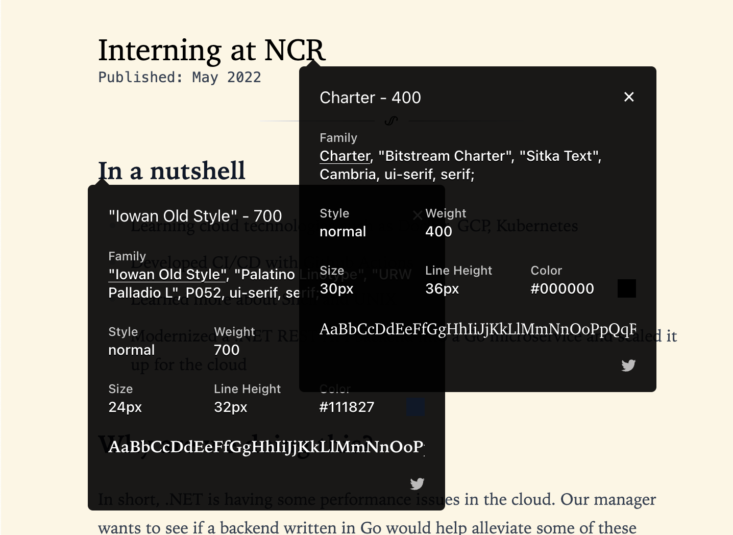
On this website specifically, I also mixed and matched different types of fonts. A monospaced font with small-cap serifs for the categories. A different font for the title versus the headings in articles. Iowan Old Style didn’t seem straight and formal enough for a title; the text wanted to twist and turn and seemed to not fix neatly in a box. But I found it great for headings and body copy–it makes the page dynamic. I did these because what I had beforehand just didn’t feel right, so I changed the fonts around until they did.


Types of writing
Modern, internet based writing seems to be based on interactive content (code, photos, videos, audio, diagrams, LaTeX) with an infinite scroll and headers. There is a line between paragraphs, which seems to suit print media well, probably because empty lines create confusion going between pages and takes up more paper.
Some Greek writing is a dialogue between two people. The Muqaddimah lists a bunch of principles at the top, then tells the story. Herodotus seems to give history as a series of numbered events. Keynes would put in some poetry in his economics articles.
We can do so much more.